
.png)
Designing a Storefront Worthy of a Premium Brand
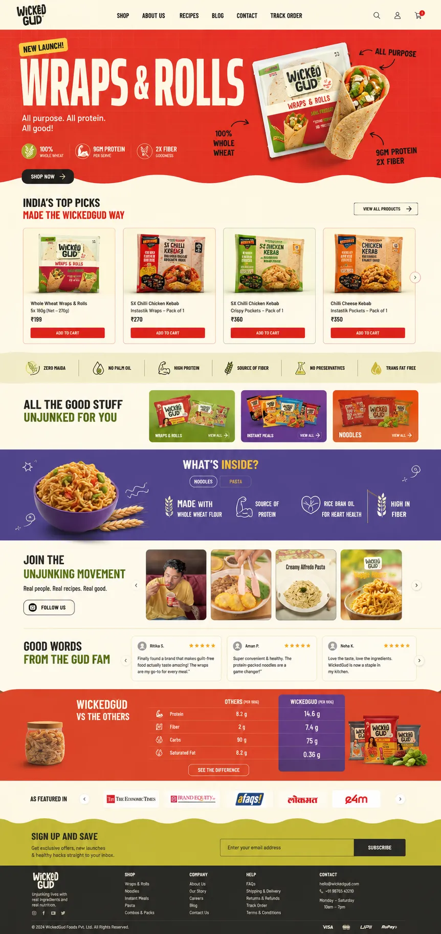
UX teardown of WickedGud's ecommerce homepage
Introduction
WickedGud has built a strong product story around a simple promise: healthier comfort food without compromising taste. From high-protein noodles and pasta to whole-wheat wraps, the brand positions itself as a premium alternative in a crowded FMCG market.
The challenge wasn't the products, it was the digital storefront.
Several sections across the homepage were incomplete, difficult to read, or missing content entirely. Instead of reinforcing trust, the website introduced unnecessary friction before customers had even explored the product catalogue.
This audit reviews those issues from a business, UX, and technical perspective before presenting a redesign direction that prioritizes clarity, credibility, and conversion.
Executive Summary
Business
WickedGud competes in India's rapidly growing premium packaged food category by differentiating itself through ingredient quality rather than price. Products such as protein-rich noodles, pasta, and wraps rely heavily on education and trust because customers cannot physically evaluate them before purchasing.
Core Finding
The homepage was visually engaging but several important content modules were either incomplete, inaccessible, or failing to communicate product value.
Rather than encouraging exploration, these issues interrupted the purchasing journey.
Primary Issues
- Hero typography overflowing beyond the viewport
- Empty category showcase modules
- Ingredient benefits becoming unreadable due to poor contrast
- Testimonials displaying star ratings without actual reviews
- Weak content hierarchy across several sections
- Premium messaging unsupported by premium presentation
Redesign Direction
Instead of changing the visual identity, the redesign focused on rebuilding the information architecture, improving readability, strengthening product storytelling, and ensuring every section delivered meaningful content.
Understanding the Business
Unlike traditional FMCG brands competing primarily on price, WickedGud sells a healthier alternative.
That changes how the website should behave.
Customers need answers before they purchase:
- Why is this healthier?
- What makes it different?
- Is the higher price justified?
- Can I trust the ingredients?
- Do other people actually enjoy it?
Every homepage section should reduce uncertainty.
Instead, several sections increased it.
Audit Findings
1. Hero Section
Observation
The hero immediately captures attention through bold colours and packaging imagery, but the oversized display typography extends beyond the viewport.
Important visual content becomes clipped, reducing readability while making the hero feel unfinished.
Business Impact
The hero is responsible for creating the first impression.
When typography appears broken, users subconsciously question the overall quality of the website—and by extension, the quality of the brand itself.
Redesign
The revised hero introduces:
- Better type scaling
- Balanced spacing
- Stronger visual hierarchy
- Improved product positioning
- Clearer promotional messaging
The objective wasn't to make the hero louder.
It was to make it easier to understand.
2. Product Category Discovery
Observation
The "All The Good Stuff Unjunked For You" section was intended to showcase major product categories.
Instead, the cards failed to render correctly, leaving a large empty content block.
Business Impact
Category discovery is one of the primary navigation mechanisms for ecommerce.
Missing content forces users to search manually while reducing opportunities for product discovery.
Redesign
The redesign introduces fully populated category cards with:
- Strong product imagery
- Clear labels
- Consistent layouts
- Better visual separation
The section now behaves as a navigational feature rather than decorative whitespace.
3. Ingredient Storytelling
Observation
One of WickedGud's strongest differentiators—ingredient quality—became almost invisible.
The "What's Inside?" section displayed nutritional benefits using extremely low-contrast typography against a dark purple background.
Although technically present, the content was practically unreadable.
Business Impact
Premium food brands justify pricing through education.
If customers cannot easily understand ingredient benefits, one of the brand's biggest competitive advantages disappears.
Redesign
The redesign focuses on:
- Higher contrast
- Larger typography
- Better spacing
- Stronger iconography
- Clear ingredient hierarchy
Rather than decorating the section, the redesign prioritizes readability.
4. Social Proof
Observation
The testimonials module displayed rating stars but contained no meaningful customer content.
Reviewer names, profile images, and review text were absent.
Business Impact
Social proof only works when it feels authentic.
Empty testimonials create uncertainty and reduce credibility far more than omitting the section altogether.
Redesign
The revised testimonial system includes:
- Customer names
- Profile images
- Complete review text
- Better spacing
- Improved card hierarchy
The section now contributes genuine trust signals instead of appearing unfinished.
5. Visual Hierarchy
Observation
Although individual sections contained attractive graphics, the homepage lacked a consistent rhythm.
Spacing, typography, and content density varied significantly between sections.
Some areas felt overloaded while others appeared almost empty.
Business Impact
Inconsistent hierarchy increases cognitive load.
Instead of naturally progressing through the page, users must repeatedly interpret new layouts and visual patterns.
Redesign
The new layout establishes a clearer content rhythm through:
- Consistent spacing
- Reusable section structures
- Predictable typography scales
- Improved card layouts
- Better white space distribution
The result is a page that feels more intentional while remaining visually playful.
Design System Improvements
The redesign wasn't limited to aesthetics.
Several structural improvements make future content management significantly easier.
UI Improvements
- Improved typography hierarchy
- Better colour accessibility
- Consistent spacing system
- Standardized buttons
- Unified product cards
- Cleaner section transitions
UX Improvements
- Better content discoverability
- Faster product scanning
- Stronger purchase flow
- Improved readability
- Clearer category navigation
- Reduced visual clutter
CMS Improvements
The redesigned structure also assumes stronger CMS discipline by ensuring dynamic content blocks render consistently instead of exposing incomplete modules.
Business Perspective
Most ecommerce redesigns focus on appearance.
This one focuses on trust.
Every incomplete section quietly reduces confidence.
Every missing testimonial makes premium pricing harder to justify.
Every unreadable ingredient callout weakens the brand's core differentiator.
The redesign doesn't simply modernize the interface.
It helps the website communicate the same product quality that WickedGud has already built into its packaging.
What I'd Prioritize Next
If this project continued beyond the homepage, these would be the next priorities:
- Product detail pages with richer ingredient storytelling.
- Faster mobile interactions and optimized image delivery.
- Structured review collection integrated into the CMS.
- Personalized product recommendations.
- Recipe-led content marketing connected to ecommerce.
- Better search and filtering.
- Subscription and repeat-purchase journeys.
Final Thoughts
Great consumer brands don't earn trust through advertising alone.
They earn it through consistency.
When the packaging, messaging, and website all communicate the same level of quality, customers feel confident purchasing even without seeing the product in person.
WickedGud already has a distinctive visual identity and a compelling product story. This redesign focuses on ensuring the digital experience supports that story rather than unintentionally undermining it. The goal wasn't to reinvent the brand, it was to remove the friction preventing the website from expressing the premium experience the products already promise.
From Outdated to
High-Converting

This project wasn't about changing colors, it was about rethinking how users experience the brand. Every screen was redesigned with clearer messaging, modern visuals, improved hierarchy, and conversion-focused layouts.
The redesign direction began by addressing a more fundamental question than layout or aesthetics: does the homepage visually communicate the product it's selling? WickedGud positions itself as an alternative to conventional processed foods, real ingredients, whole grains, and cleaner nutrition yet the existing experience relied on aggressive color blocking and inconsistent visual language that felt closer to the snack aisle than a premium wellness brand. The new direction introduces a calmer visual hierarchy, cleaner typography, stronger whitespace, and content-first layouts that allow the products, ingredients, and brand story to become the primary focus instead of competing backgrounds.
Beyond aesthetics, the redesign also resolves several execution issues that affected credibility. Product categories are clearly surfaced, ingredient information becomes readable, testimonials are properly populated, and mobile layouts are designed to preserve clarity across devices. While this concept addresses many of the structural and content problems identified during the audit, the broader color system remains an area for future refinement. Rather than claiming a finished solution, the redesign represents the first step toward aligning the storefront with the premium experience the brand has always promised.



Insights on design, strategy & web development






The Quick Answers
Still curious? Let's talk.
Whether it's a project, opportunity, or just an interesting idea, I'm always open to good conversations.